Designing better infographics
I think creating infographics that are successful for your clients or your business are rooted in these three things:
- deep research
- brand identity
- and an empathetic view of your ideal user
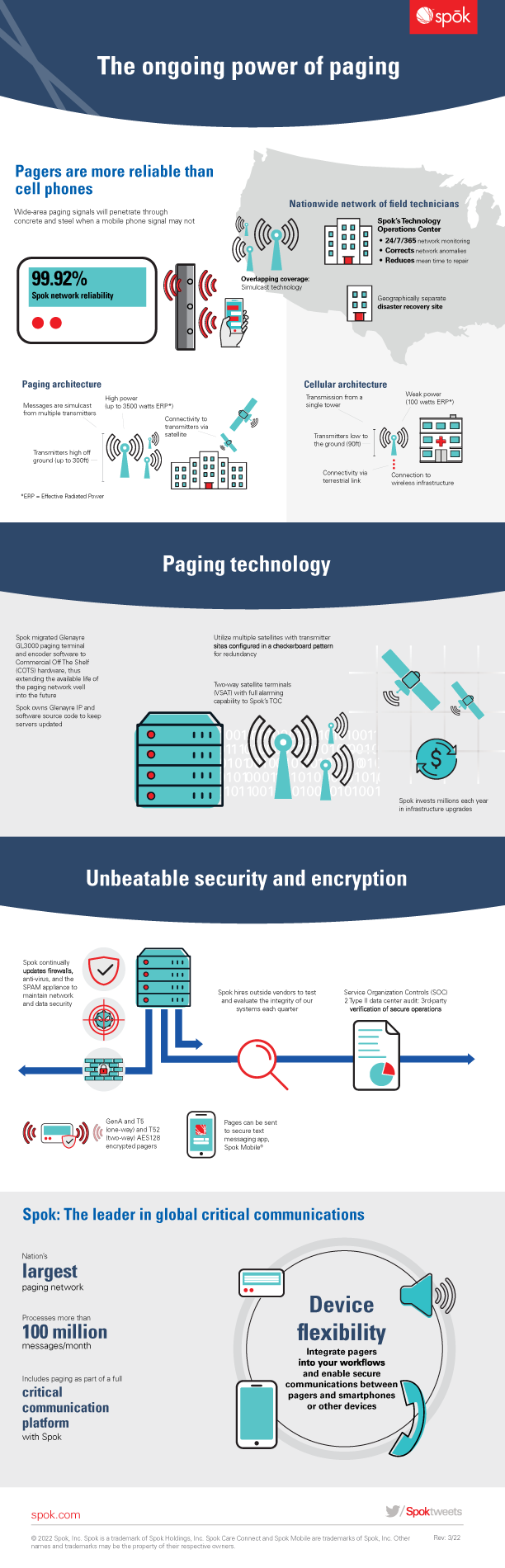
For this example, I am using a paging inforgraphic I created for the company, Spok, a healthcare IT company.
With this, we had the opportunity to understand paging architecture with some of our product team. Understanding the entirety of the product or information you are going to create an infographic on will truly help the design. This is that deep research. The better you understand the topic, the easier it will be for you to explain in plain language or a visual format. It’s worth it to spend at least 30 minutes to an hour researching or learning more about the topc – more than just the content the client gave you.
From 2019 to 2021, Spok underwent a redesign where we incorporated the works of a design agency, stock assets, and my own personal work into a cohesive look and feel. I got to work with some seriously talented design consultants, and together we transformed Spok’s look into a more flat, modern look. This establishes our brand identity.
Some of the more important factors on this inforgraphic was a combination of ensuring the explanation and illustration of the workflows within it make enough sense to the reader. More specifically, maybe to a person who is not familiar with how pagers work. When thinking about how to write this infographic, my team discussed how this could be interpretted by users of the products, and manager of said users. Those are our ideal users – not IT experts who understand the inner workings of a lot of technology.
infographics and workflow design tips
There are a few takeaways to know when designing for any workflows or infographics that may include how a product or technology works.
- design without text – I try to have the goal to ensure all my workflows or illustrations could be easily undestandable without text (or as close as you can get).
- create sections that make sense – We had to first explain both cellular and paging architecture to the user to ensure the next two sections made contextual sense.
- visual low and variety – I think ensuring each section flows or leads to the next is important, as well as insuring every single section feels balanced – sometimes that means playing with alignment to ensuring the overall look has a balanced weight.
Infographics can be one of the more fun pieces to create because they focus on educating the user on a specifc topic, all the while getting to use a specific brand language to educate the user. Sometimes, graphic design can feel like a very fun puzzle.