The story
So here’s a fun challenge I tackled in 2021, transforming our event marketing strategy in 2021. We were taking our annual customer conference virtual, and it was the perfect opportunity to rethink our whole approach to event branding. See, historically, our event marketing had always been tied to location themes (you know, “Experience Vegas!” or “Chicago Nights!”) rather than leveraging our actual brand identity.
When I got the green light to handle the conference branding, I saw it as the perfect opportunity to show off our fresh new look. The timing was perfect too – we’d just shifted our focus back to the solutions our customers actually loved, rather than getting caught up in some still-in-the-works product.
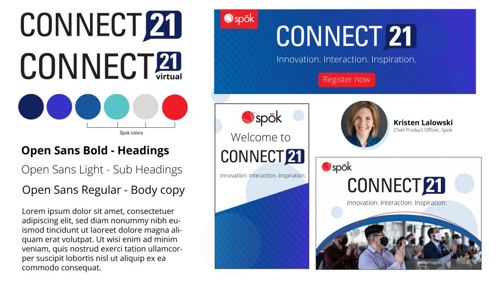
I felt very passionately about changing our event’s theme to something that aligns closer with our company’s look and feel. I felt like as we market this event, we market ourselves. Think of your event as an extension of your brand story, not a separate entity. When you stick to your brand guidelines for conference branding, you’re actually doing yourself several favors:
- Building Brand Recognition Your audience already knows and trusts your brand. When your event feels like a natural extension of that brand, you’re reinforcing that trust instead of asking them to connect with something totally new. It’s like meeting an old friend wearing a new outfit versus trying to recognize them in a costume.
- Saving Time and Resources Creating a completely new theme each year means starting from scratch – new color schemes, new design elements, new everything. By working within your brand guidelines, you’ve got a solid foundation to build on. You can focus on making your event unique through content and experience rather than reinventing your visual identity.
- Creating a Consistent Story When your event branding aligns with your overall brand, everything feels more cohesive. Your marketing materials, presentations, and event collateral all tell the same story. Think about big brands like Apple – their events feel distinctly “Apple” while still being exciting and fresh.
- Making it Easier for Your Team Your design and marketing teams already know your brand guidelines inside and out. Working within these parameters while adding event-specific elements is much more efficient than developing and documenting entirely new brand standards for each event.
That said, this doesn’t mean your events have to look identical year after year. You can still create unique sub-themes or variations that work within your brand framework – kind of like how each iPhone is distinctly Apple, but has its own unique features and personality.
Remember: your brand is an investment. Each time you reinforce it – even at events – you’re building its value rather than starting over.
Let me tell you about our brand’s secret sauce – it’s all about a wheel concept. Pretty clever, right? Our whole visual identity revolves around (pun intended!) this idea that Spok’s solutions are interconnected, like spokes in a wheel. It’s not just a pretty design choice – it represents how we help hospitals speed up communication between their contact centers and medical departments. You can see it in our logo’s orb and these cool wave patterns we use across our materials.
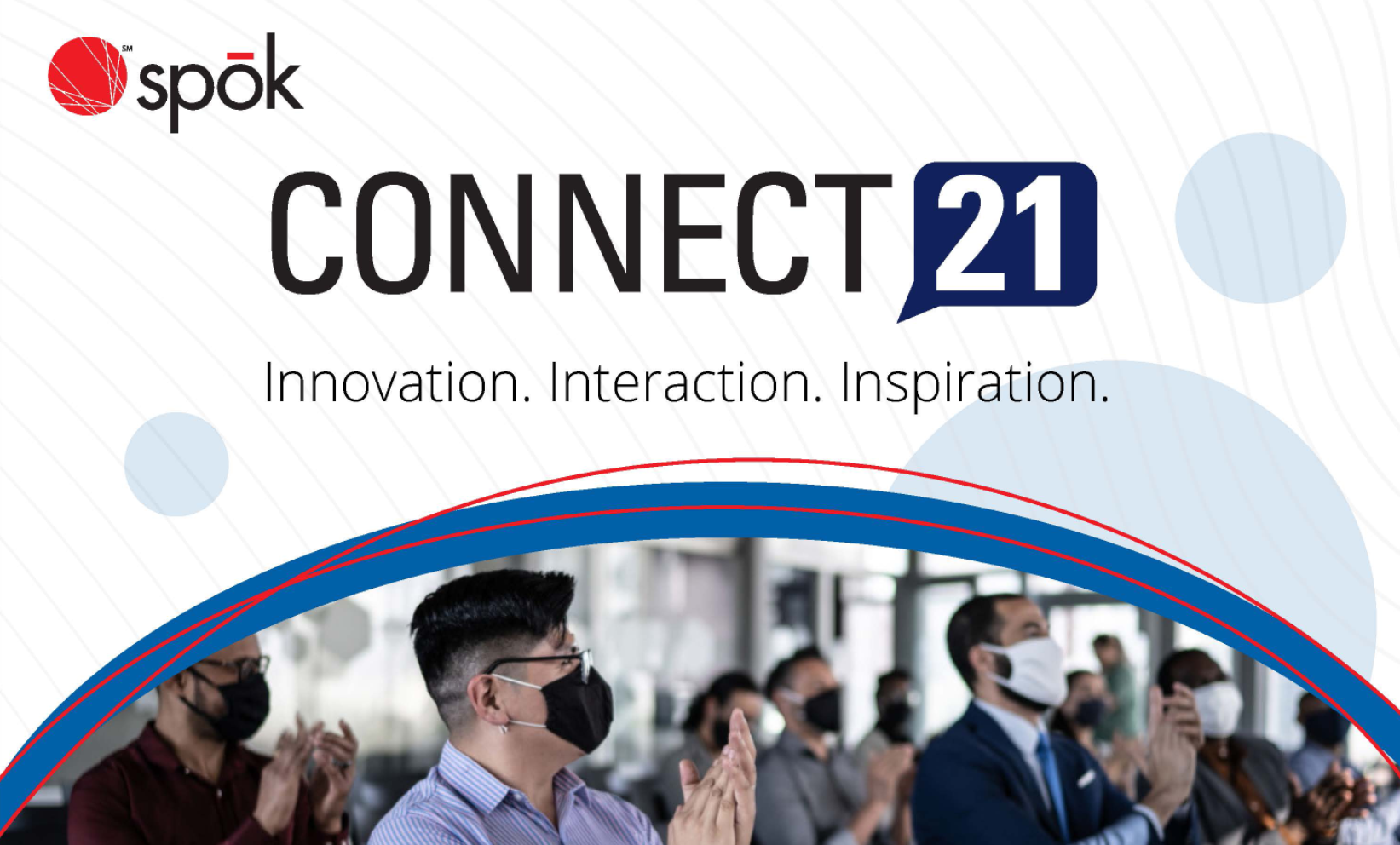
the finished look
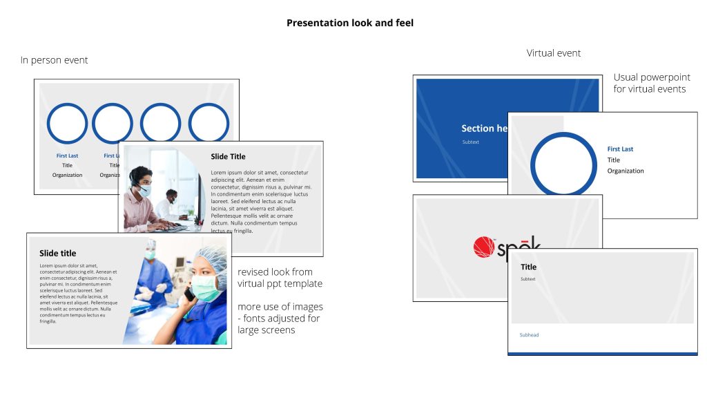
For the conference theme, we landed on “Innovation. Interaction. Inspiration.” (I mean, who doesn’t love a good triple-threat?). The goal was to show our customers that even in this virtual format, we were still bringing our A-game – showcasing product updates, creating spaces for hospitals to share their Spok success stories, and giving everyone a peek at our product roadmap. It was all about making those virtual connections feel just as engaging as our in-person events.


(*note: we had originally planned for this to be both in person and virtual – but made the choice to go full virtual due to COVID)
